In times of mourning, funeral programs serve as a tangible tribute to the departed, encapsulating memories, moments, and the essence of a life lived. As you prepare to create a funeral programs, one crucial element to consider is the font. Fonts play a significant role in conveying the tone and emotion of the program, making it essential to choose the right typeface that honors your loved one’s memory.
Importance of Font Selection for Funeral Programs
The font you choose for a funeral program can deeply impact the overall look and feel of the document. Here are some key reasons why font selection is crucial:
Reflecting the Tone: The font sets the tone for the entire program. Whether you want to convey a sense of solemnity, elegance, or warmth, the right font can help achieve this.
Readability: It’s important to choose a font that is easy to read, especially for older individuals or those with visual impairments attending the service.
Personalization: The font choice can be a subtle way to personalize the program and reflect the personality and style of the departed.
Consistency: Using a consistent font throughout the program creates a cohesive look and enhances the overall design.
Factors to Consider When Choosing a Font
When selecting a font for a funeral program, consider the following factors:
Legibility
Choose a font that is clear and easy to read, even at smaller sizes. Avoid overly decorative or elaborate fonts that may be difficult to decipher.
Appropriateness
The font should be appropriate for the solemnity of the occasion. Avoid using overly casual or playful fonts that may detract from the gravity of the event.
Emotional Impact
Consider how the font conveys emotion. Some fonts may evoke a sense of warmth and comfort, while others may convey a more formal or traditional feeling.
Style
The font should complement the overall style and theme of the program. For example, a classic serif font may be more suitable for a traditional service, while a modern sans-serif font may be more appropriate for a contemporary program.
Versatility
Choose a font that is versatile and can be used for various elements of the program, such as headings, body text, and captions.
Recommended Fonts for Funeral Programs
While the choice of font ultimately depends on personal preference and the specific requirements of the program, here are some commonly recommended fonts for funeral programs:
Garamond: A classic serif font that is elegant and easy to read, making it suitable for formal occasions.
Times New Roman: Another classic serif font that is widely used and easy to read. It conveys a sense of tradition and formality.
Calibri: A modern sans-serif font that is clean and easy to read. It can add a contemporary touch to the program while maintaining readability.
Arial: A simple sans-serif font that is highly legible, especially at smaller sizes. It is a versatile choice that can work well for both headings and body text.
Georgia: A serif font that is similar to Times New Roman but with a slightly more modern look. It is a good alternative if you want a traditional font with a twist.
Funeral Program Templates
-
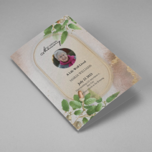
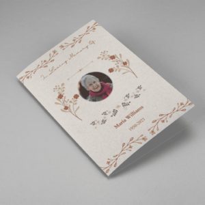
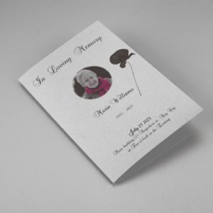
Searching for a Oak Leaf With Gold Oval Frame Half Page Funeral Program that is easy to print and amass and has a cutting-edge look? The Oak Leaf With Gold Oval Frame Half Page Funeral Program is the Perfect decision because it measures 8.5”x 5.5”.
- No Limitation on Content, Edit anything
- Edit anytime – unlimited revisions even after purchased
- Get a printable PDF downloaded to get it printed on your own.
-
Searching for a Brown and White Classic Funeral Program Half Page Program that is easy to print and amass and has a cutting-edge look? The Brown and White Classic Funeral Program Half Page Program is the Perfect decision because it measures 8.5”x 5.5”.
- No Limitation on Content, Edit anything
- Edit anytime – unlimited revisions even after purchased
- Get a printable PDF downloaded to get it printed on your own.
-
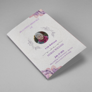
Searching for a Purple Elegant Watercolor Half Page Funeral Program Template that is easy to print and amass and has a cutting-edge look? The Purple Elegant Watercolor Half Page Funeral Program Template is the Perfect decision because it measures 8.5”x 5.5”.
- No Limitation on Content, Edit anything
- Edit anytime – unlimited revisions even after purchased
- Get a printable PDF downloaded to get it printed on your own.
-
Searching for a Cream and Green Photo Obituary Half Page Program that is easy to print and amass and has a cutting-edge look? The Cream and Green Photo Obituary Half Page Program is the Perfect decision because it measures 8.5”x 5.5”.
- No Limitation on Content, Edit anything
- Edit anytime – unlimited revisions even after purchased
- Get a printable PDF downloaded to get it printed on your own.
-
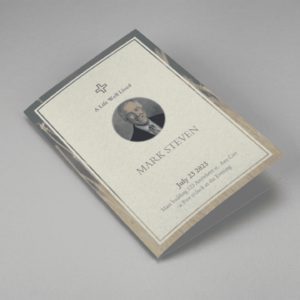
Searching for a Cream Simple Elegant Photo Church Half Page Program that is easy to print and amass and has a cutting-edge look? The Cream Simple Elegant Photo Church Half Page Program is the Perfect decision because it measures 8.5”x 5.5”.
- No Limitation on Content, Edit anything
- Edit anytime – unlimited revisions even after purchased
- Get a printable PDF downloaded to get it printed on your own.
-
Searching for a Samovar Silver Half Page Funeral Program Template that is easy to print and amass and has a cutting-edge look? The Samovar Silver Half Page Funeral Program Template is the Perfect decision because it measures 8.5”x 5.5”.
- No Limitation on Content, Edit anything
- Edit anytime – unlimited revisions even after purchased
- Get a printable PDF downloaded to get it printed on your own.
-
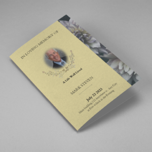
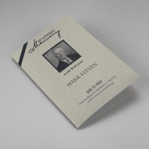
Searching for an Elegant Beige Half Page Funeral Program Template that is easy to print and amass and has a cutting-edge look? The Elegant Beige Half-Page Funeral Program Template is the Perfect decision because it measures 8.5”x 5.5”.
- No Limitation on Content, Edit anything
- Edit anytime – unlimited revisions even after purchased
- Get a printable PDF downloaded to get it printed on your own.
-
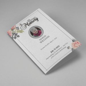
Searching for a White Floral Pro Half Page Funeral Program Template that is easy to print and amass and has a cutting-edge look? White Floral Pro Half Page Funeral Program Template is the Perfect decision because it measures 8.5”x 5.5”.
- No Limitation on Content, Edit anything
- Edit anytime – unlimited revisions even after purchased
- Get a printable PDF downloaded to get it printed on your own.
-
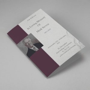
Searching for a Grey and Burgundy Elegant Half Page Funeral Program Template that is easy to print and amass and has a cutting-edge look? Grey and Burgundy Elegant Half Page Funeral Program Template is the Perfect decision because it measures 8.5”x 5.5”.
- No Limitation on Content, Edit anything
- Edit anytime – unlimited revisions even after purchased
- Get a printable PDF downloaded to get it printed on your own.
-
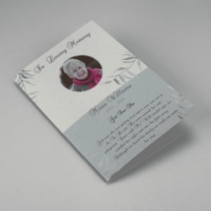
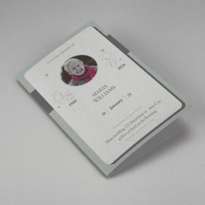
Searching for a Soft Green and Grey Minimalist Floral Half Page Funeral Program Template that is easy to print and amass and has a cutting-edge look? Soft Green and Grey Minimalist Floral Half Page Funeral Program Template is the Perfect decision because it measures 8.5”x 5.5”.
- No Limitation on Content, Edit anything
- Edit anytime – unlimited revisions even after purchased
- Get a printable PDF downloaded to get it printed on your own.
-
Searching for a Gray Elegant Oval Frame Half Page Funeral Program Template that is easy to print and amass and has a cutting-edge look? Gray Elegant Oval Frame Half Page Funeral Program Template is the Perfect decision because it measures 8.5”x 5.5”.
- No Limitation on Content, Edit anything
- Edit anytime – unlimited revisions even after purchased
- Get a printable PDF downloaded to get it printed on your own.
-
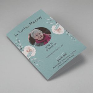
Searching for a Blue Organic Minimal Half Page Funeral Program Template that is easy to print and amass and has a cutting-edge look? Blue Organic Minimal Half Page Funeral Program Template is the Perfect decision because it measures 8.5”x 5.5”.
- No Limitation on Content, Edit anything
- Edit anytime – unlimited revisions even after purchased
- Get a printable PDF downloaded to get it printed on your own.
-
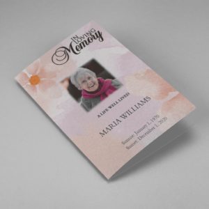
Searching for a Pink and Orange Watercolour Half Page Funeral Program Template that is easy to print and amass and has a cutting-edge look? Pink and Orange Watercolour Half Page Funeral Program Template is the Perfect decision because it measures 8.5”x 5.5”.
- No Limitation on Content, Edit anything
- Edit anytime – unlimited revisions even after purchased
- Get a printable PDF downloaded to get it printed on your own.
-
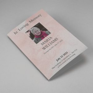
Searching for a Pink Floral Paper Half Page Funeral Program Template that is easy to print and amass and has a cutting-edge look? Pink Floral Paper Half Page Funeral Program Template is the Perfect decision because it measures 8.5”x 5.5”.
- No Limitation on Content, Edit anything
- Edit anytime – unlimited revisions even after purchased
- Get a printable PDF downloaded to get it printed on your own.
Funeral Programs : Helping Videos
Frequently Asked Questions On Font For Funeral Program
Can I use any font for a funeral program?
While you have a wide range of fonts to choose from, it’s important to select one that is appropriate for the occasion. Avoid overly decorative or casual fonts and opt for ones that are clear, readable, and convey the desired tone.
Should I use different fonts for headings and body text?
Using different fonts for headings and body text can help create hierarchy and improve readability. However, ensure that the fonts complement each other and maintain a cohesive look throughout the program.
Can I use a handwritten font for a personal touch?
Using a handwritten font can add a personal touch to the program, but ensure that the font is still legible and appropriate for the occasion. Consider using it sparingly for headings or accents rather than for large blocks of text.
What font size should I use for a funeral program?
The font size should be chosen based on readability. For body text, a font size of 10-12 points is generally recommended, while headings can be slightly larger for emphasis. Adjust the font size as needed to ensure clarity, especially for older individuals or those with visual impairments.
Are there any fonts I should avoid for a funeral program?
Avoid using overly ornate, decorative, or novelty fonts that may be difficult to read or distract from the content. Stick to classic, timeless fonts that convey a sense of dignity and respect.


