

In moments of grief and remembrance, every detail matters, including the choice of fonts for funeral programs. The right font can convey the appropriate tone, honor the departed, and provide comfort to grieving loved ones. This comprehensive guide will help you navigate the nuanced world of typography, ensuring that your funeral program is both aesthetically pleasing and respectful.
Understanding the Importance of Font Selection
Fonts play a crucial role in conveying emotions, setting the mood, and enhancing readability. When selecting fonts for funeral programs, it’s essential to strike a balance between elegance, clarity, and appropriateness. The chosen fonts should reflect the solemnity of the occasion while ensuring that the information is easily accessible to attendees.
Factors to Consider When Choosing Fonts
Legibility
Opt for fonts that are easy to read, especially for older individuals or those with visual impairments. Avoid overly decorative or elaborate fonts that may sacrifice clarity for style.
Tone and Mood
Consider the emotional tone of the funeral program. Serif fonts like Times New Roman or Georgia are often associated with tradition and formality, while sans-serif fonts like Arial or Calibri convey a more modern and straightforward vibe.
Cultural Sensitivity
Take into account the cultural background and preferences of the deceased and their family. Certain fonts may hold cultural or religious significance and should be chosen accordingly.
Brand Consistency
If the funeral program is part of a larger branding effort, ensure consistency with existing fonts and design elements to maintain a cohesive look and feel.
Readability Across Platforms
Keep in mind that the funeral program may be printed or viewed digitally. Choose fonts that are easily readable both in print and on screens of varying sizes.
Best Fonts for Funeral Programs
Times New Roman
A classic serif font that exudes tradition and elegance. Its timeless appeal and excellent readability make it a popular choice for formal occasions such as funerals.
Garamond
Another serif font is known for its sophistication and legibility. Garamond’s slender serifs and graceful curves lend a touch of refinement to funeral program designs.
Arial
A versatile sans-serif font that offers clean lines and easy readability. Arial is a popular choice for modern and minimalist funeral programs, where simplicity and clarity are paramount.
Cambria
A serif font designed for on-screen readability, making it an excellent choice for digital funeral programs or slideshows. Cambria’s balanced proportions and clear letterforms ensure optimal legibility in various contexts.
Calibri
A contemporary sans-serif font is favored for its clean lines and modern aesthetic. Calibri’s simple yet stylish design makes it suitable for both print and digital funeral programs, particularly for those seeking a more contemporary look.
Tips for Pairing Fonts
- Contrast: Pair serif and sans-serif fonts for visual interest and improved readability. For example, use a serif font for headings and a sans-serif font for body text.
- Consistency: Limit the number of fonts used to maintain visual harmony and coherence. Stick to two or three complementary fonts throughout the funeral program.
- Hierarchy: Establish a clear hierarchy by using different font weights, sizes, and styles to differentiate between headings, subheadings, and body text. This helps guide readers through the program and highlights essential information effectively.
Funeral Programs Templates
-
 Sale
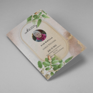
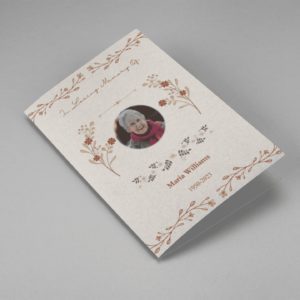
SaleSearching for a Oak Leaf With Gold Oval Frame Half Page Funeral Program that is easy to print and amass and has a cutting-edge look? The Oak Leaf With Gold Oval Frame Half Page Funeral Program is the Perfect decision because it measures 8.5”x 5.5”.
- No Limitation on Content, Edit anything
- Edit anytime – unlimited revisions even after purchased
- Get a printable PDF downloaded to get it printed on your own.
-
 Sale
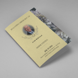
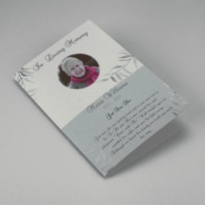
SaleSearching for a Brown and White Classic Funeral Program Half Page Program that is easy to print and amass and has a cutting-edge look? The Brown and White Classic Funeral Program Half Page Program is the Perfect decision because it measures 8.5”x 5.5”.
- No Limitation on Content, Edit anything
- Edit anytime – unlimited revisions even after purchased
- Get a printable PDF downloaded to get it printed on your own.
-
 Sale
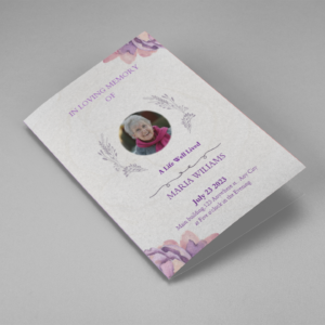
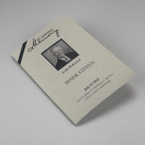
SaleSearching for a Purple Elegant Watercolor Half Page Funeral Program Template that is easy to print and amass and has a cutting-edge look? The Purple Elegant Watercolor Half Page Funeral Program Template is the Perfect decision because it measures 8.5”x 5.5”.
- No Limitation on Content, Edit anything
- Edit anytime – unlimited revisions even after purchased
- Get a printable PDF downloaded to get it printed on your own.
-
 Sale
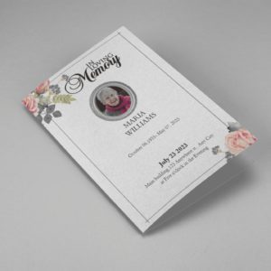
SaleSearching for a Cream and Green Photo Obituary Half Page Program that is easy to print and amass and has a cutting-edge look? The Cream and Green Photo Obituary Half Page Program is the Perfect decision because it measures 8.5”x 5.5”.
- No Limitation on Content, Edit anything
- Edit anytime – unlimited revisions even after purchased
- Get a printable PDF downloaded to get it printed on your own.
-
 Sale
SaleSearching for a Cream Simple Elegant Photo Church Half Page Program that is easy to print and amass and has a cutting-edge look? The Cream Simple Elegant Photo Church Half Page Program is the Perfect decision because it measures 8.5”x 5.5”.
- No Limitation on Content, Edit anything
- Edit anytime – unlimited revisions even after purchased
- Get a printable PDF downloaded to get it printed on your own.
-
 Sale
SaleSearching for a Samovar Silver Half Page Funeral Program Template that is easy to print and amass and has a cutting-edge look? The Samovar Silver Half Page Funeral Program Template is the Perfect decision because it measures 8.5”x 5.5”.
- No Limitation on Content, Edit anything
- Edit anytime – unlimited revisions even after purchased
- Get a printable PDF downloaded to get it printed on your own.
-
 Sale
SaleSearching for an Elegant Beige Half Page Funeral Program Template that is easy to print and amass and has a cutting-edge look? The Elegant Beige Half-Page Funeral Program Template is the Perfect decision because it measures 8.5”x 5.5”.
- No Limitation on Content, Edit anything
- Edit anytime – unlimited revisions even after purchased
- Get a printable PDF downloaded to get it printed on your own.
-
 Sale
SaleSearching for a White Floral Pro Half Page Funeral Program Template that is easy to print and amass and has a cutting-edge look? White Floral Pro Half Page Funeral Program Template is the Perfect decision because it measures 8.5”x 5.5”.
- No Limitation on Content, Edit anything
- Edit anytime – unlimited revisions even after purchased
- Get a printable PDF downloaded to get it printed on your own.
-
 Sale
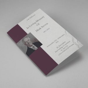
SaleSearching for a Grey and Burgundy Elegant Half Page Funeral Program Template that is easy to print and amass and has a cutting-edge look? Grey and Burgundy Elegant Half Page Funeral Program Template is the Perfect decision because it measures 8.5”x 5.5”.
- No Limitation on Content, Edit anything
- Edit anytime – unlimited revisions even after purchased
- Get a printable PDF downloaded to get it printed on your own.
-
 Sale
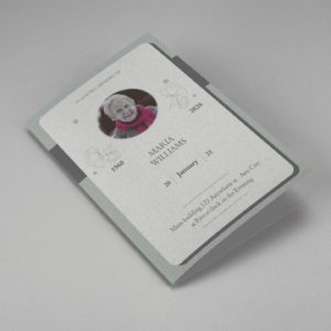
SaleSearching for a Soft Green and Grey Minimalist Floral Half Page Funeral Program Template that is easy to print and amass and has a cutting-edge look? Soft Green and Grey Minimalist Floral Half Page Funeral Program Template is the Perfect decision because it measures 8.5”x 5.5”.
- No Limitation on Content, Edit anything
- Edit anytime – unlimited revisions even after purchased
- Get a printable PDF downloaded to get it printed on your own.
-
 Sale
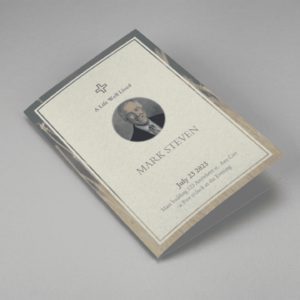
SaleSearching for a Gray Elegant Oval Frame Half Page Funeral Program Template that is easy to print and amass and has a cutting-edge look? Gray Elegant Oval Frame Half Page Funeral Program Template is the Perfect decision because it measures 8.5”x 5.5”.
- No Limitation on Content, Edit anything
- Edit anytime – unlimited revisions even after purchased
- Get a printable PDF downloaded to get it printed on your own.
-
 Sale
SaleSearching for a Blue Organic Minimal Half Page Funeral Program Template that is easy to print and amass and has a cutting-edge look? Blue Organic Minimal Half Page Funeral Program Template is the Perfect decision because it measures 8.5”x 5.5”.
- No Limitation on Content, Edit anything
- Edit anytime – unlimited revisions even after purchased
- Get a printable PDF downloaded to get it printed on your own.
-
 Sale
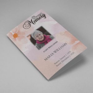
SaleSearching for a Pink and Orange Watercolour Half Page Funeral Program Template that is easy to print and amass and has a cutting-edge look? Pink and Orange Watercolour Half Page Funeral Program Template is the Perfect decision because it measures 8.5”x 5.5”.
- No Limitation on Content, Edit anything
- Edit anytime – unlimited revisions even after purchased
- Get a printable PDF downloaded to get it printed on your own.
-
 Sale
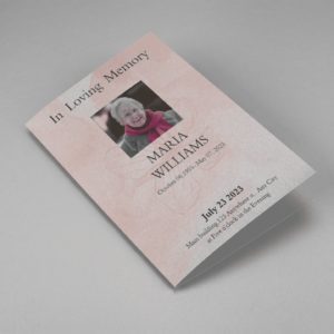
SaleSearching for a Pink Floral Paper Half Page Funeral Program Template that is easy to print and amass and has a cutting-edge look? Pink Floral Paper Half Page Funeral Program Template is the Perfect decision because it measures 8.5”x 5.5”.
- No Limitation on Content, Edit anything
- Edit anytime – unlimited revisions even after purchased
- Get a printable PDF downloaded to get it printed on your own.